What a fun project this was!
I had the great opportunity to work with design manager Kelly McManus and General Mills on the creative for this limited edition variety of Hershey’s Kisses: Cinnamon Toast Crunch!
This body of work was such a unique challenge involving thoughtfully blending two visual systems of two iconic brands that consumers love while finding a perfect balance between the two.
General Mills Cinnamon Toast Crunch is very well known for their colorful packaging, so we had to be sure we maintained the integrity of the CTC visual system without the design feeling cluttered and overly busy. After developing a few design options which you can explore below, we landed on a design system that leveraged the graphic splashes reminiscent of the Cinnamon Toast Crunch primary packaging for continuity within the portfolio of their other co-licensed products.
After nailing down the primary packaging strategy, we moved to the next phase: encompassed in the project were a few deliverables: primary 9oz packaging (including foil design), photography, and merchandising including a display ready case and a merchandising graphic panel.
TKP Studio did a knock out job translating my sketches for photo shots into the real deal. They also did an excellent job with photographing the product photography for appetite appeal on the packaging and merchandising.
The merchandising was the easiest part: translating the system to a national graphic panel and flexo printing DRC. Really thrilled with how all this work came to life and seeing it in stores!
Photography by TPK Studio.
Final front of pack and back of pack design.
Sketches developed for photo shoot.
Photography by TKP Studio.
National case and side panel merch graphics.
Initial range of front of pack and back of pack options.
The Hershey Company has been around for over 125 years and has an incredibly long history of producing some of the world’s most beloved brands. Below is a case study of some designs for what a limited edition version of their iconic cocoa could look like if there was ever an opportunity to create a nostalgic tribute design.
The study was a really fun opportunity to explore a range of layouts that incorporate actual vintage HERSHEY’S typography and illustrations and also some options that simply just use typefaces and design motifs that have a vintage look and feel.
DISCLAIMER: This is simply a case study for design exercises only, not an actual product that you will find in stores.
Line up of design exploration options. Some of these incorporate vintage HERSHEY’S illustrations and iconography like the “Bean Baby” and the illustration of the children masked in the oval shape in the top middle design. Others incorporate vintage-style imagery that are not HERSHEY ownable assets, for example, the designs in the bottom far left and bottom far right. Some of the designs even incorporate actual HERSHEY’S typography and logos that I extracted from vintage bar labels.
Some close-in crops of the designs. I wanted to explore a range of typographic styles particularly in this study - creating some options that were really typographic focused and others less so, trying different ways of warping or customizing the type to add some visual interest to the designs. I also did some research on vintage packaging to get some inspiration for type design and how type and imagery can work together in layouts.
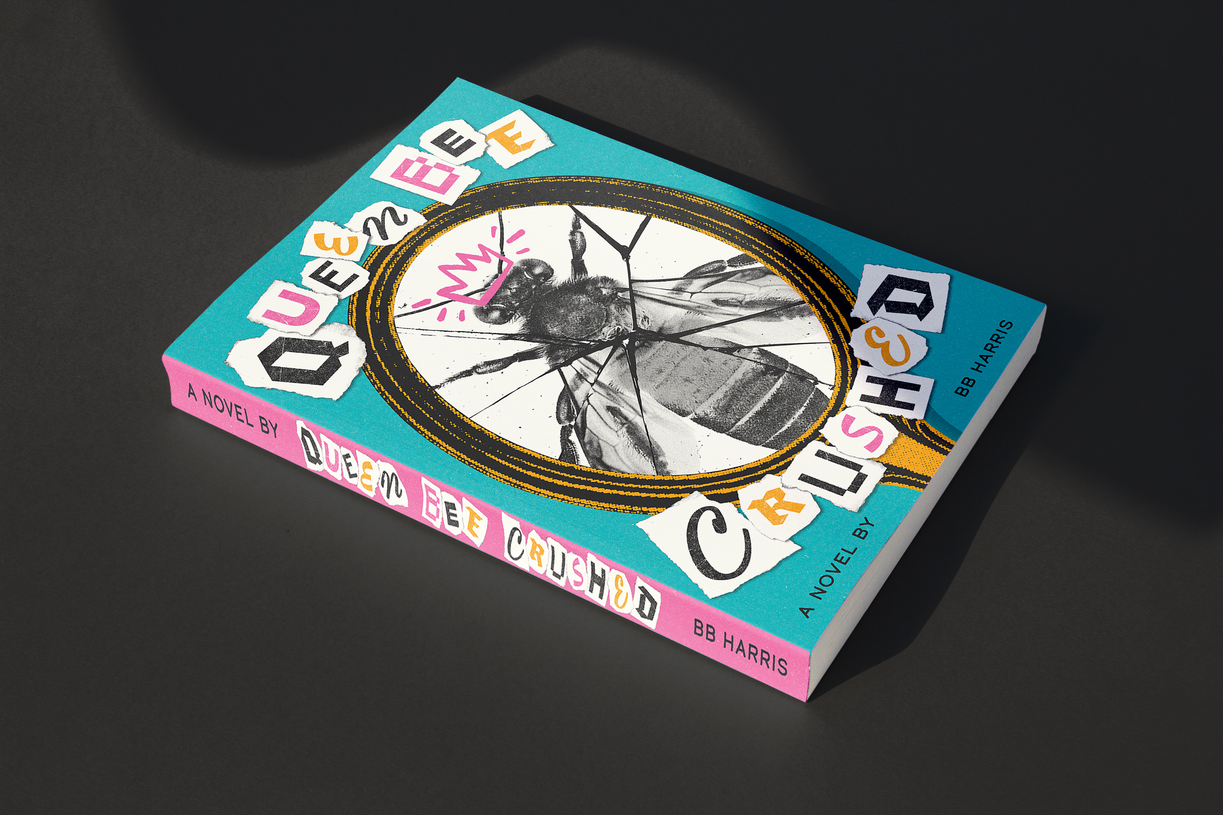
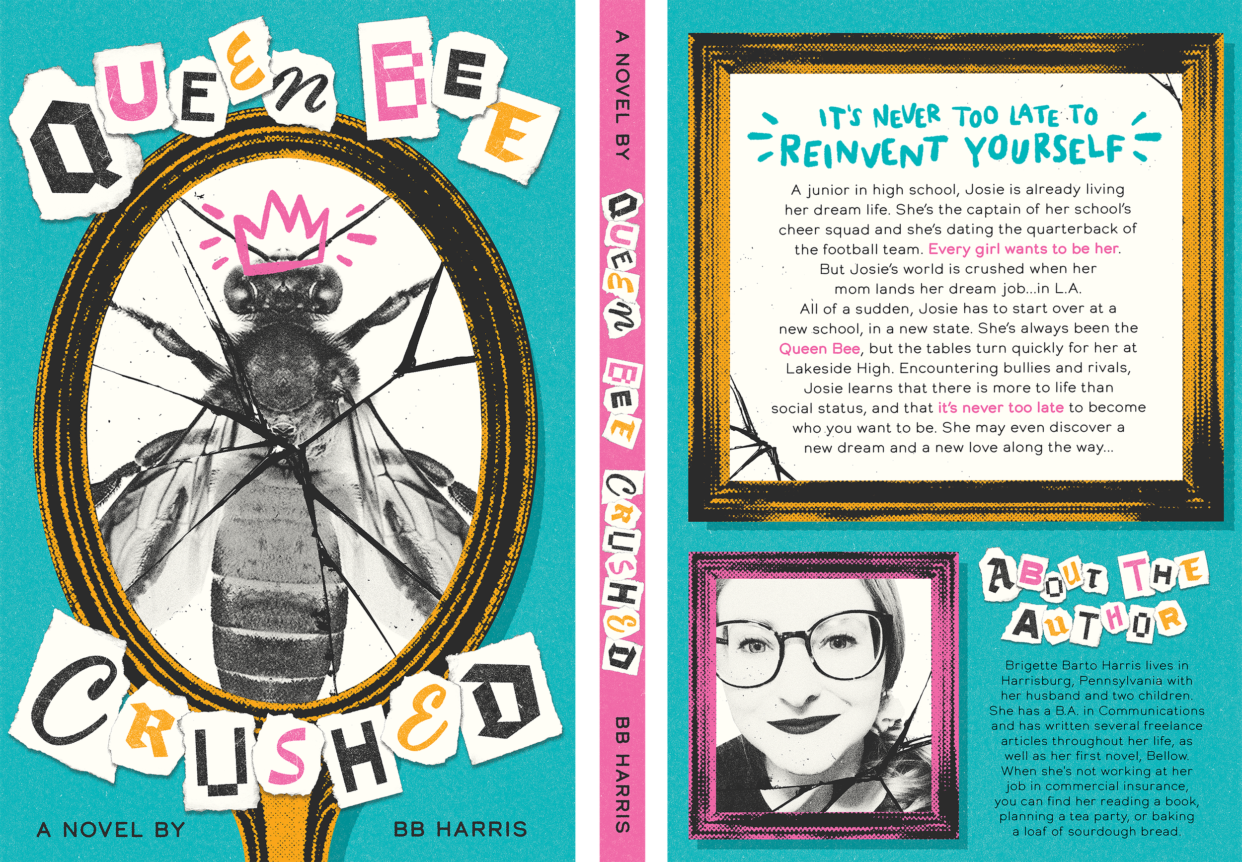
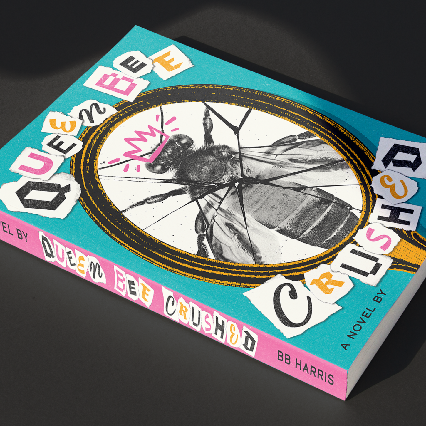
One of my dear friends, who goes by the pen name BB Harris, is an author who writes young adult novels and I had the wonderful opportunity to design the cover of her second book, Queen Bee Crushed - the story of a high school girl named Josie who’s world gets turned upside down when her mother accepts a job in Los Angeles and the family relocates from their small town where she’s the “Queen Bee” at her school. She’s forced to reinvent herself and blaze a new trail at her new school, where in the process, she encounters bullies, makes new friends and discovers who she really wants to be.
This project technically began with my reading the book first so I could fully digest the story and could feel inspired to put together some sketches and mood boards for BB to react to.
Without any spoilers, I felt inspired by grungy, collage imagery - combining photography, graphic imagery, texture and visual symbolism to achieve this final cover design.
I don't often share my work for Hershey, but this one I was too proud of to not share. I had the great opportunity to develop the strategy and graphics for the 2024/2025 PAYDAY Hard Workers program that celebrates Hard Workers with custom packaging and promotional graphics.
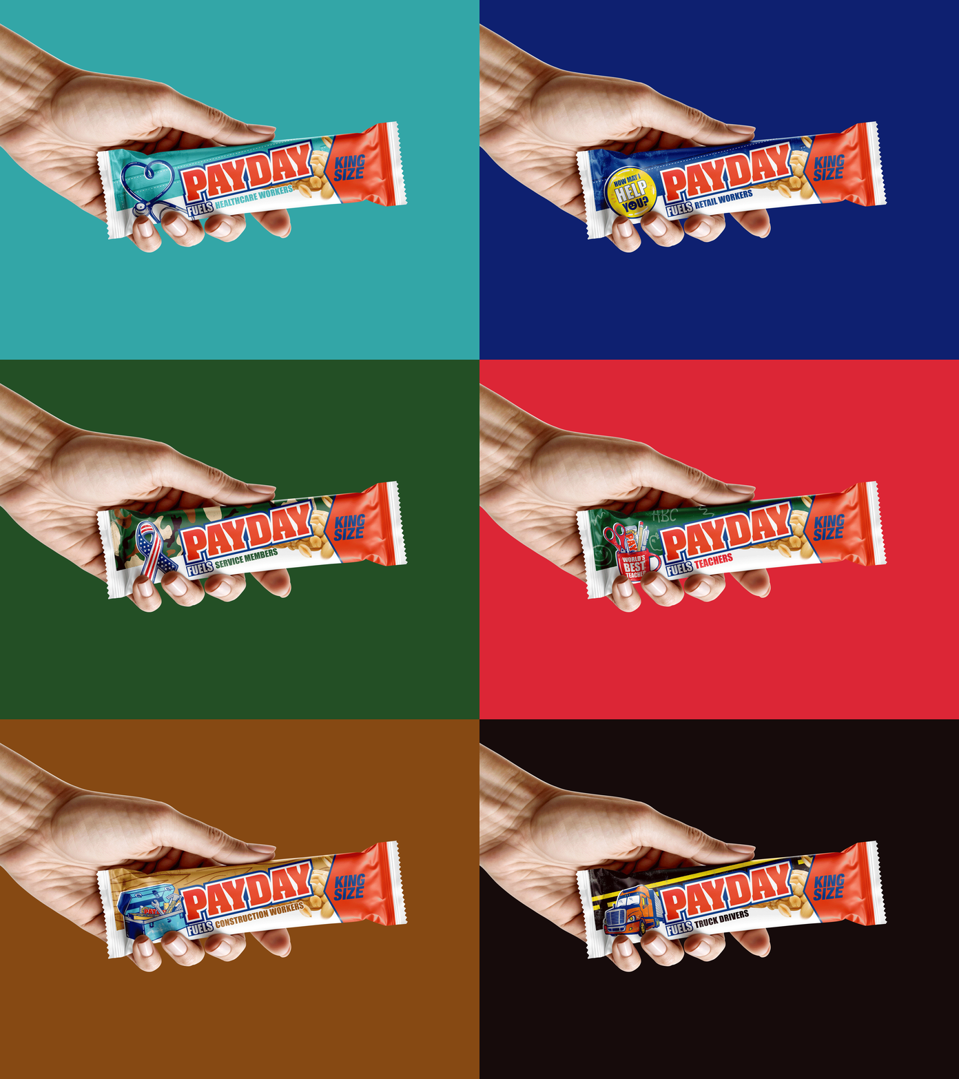
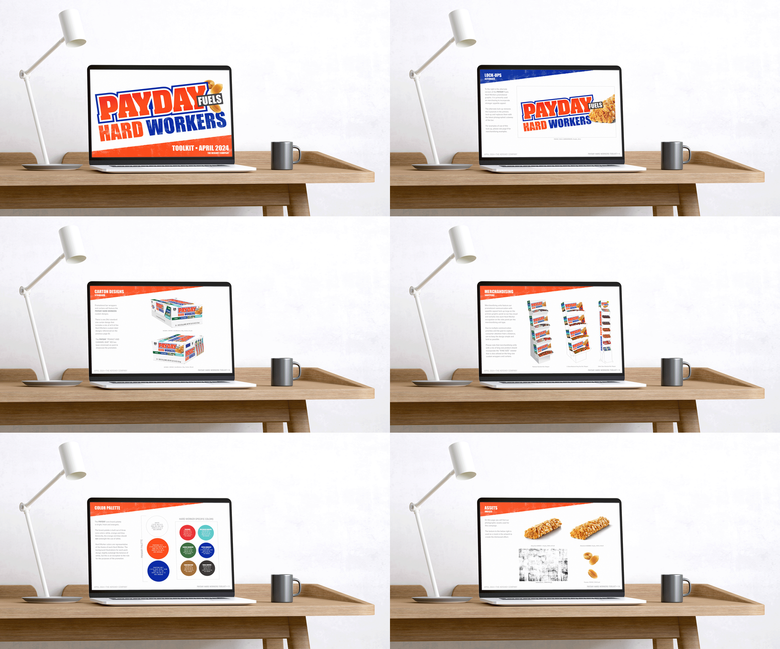
I worked with design manager Mike Pacewicz to strategize and implement custom graphics for 6 specific occupations (Healthcare Workers, Teachers, Retail Workers, Truck Drivers, Construction Workers, and Service Members) as well as develop a graphic lockup to represent the program. From there, the graphic strategy was implemented across 6 King Size label designs, 4 Regular Size label designs, 3 total custom carton designs, merchandising displays and a tool kit to serve as a point of reference for agencies who would use the assets to develop additional merchandising and applications related to the promotion.
The graphics for each occupation were custom illustrated by myself which included developing an "icon" graphic to represent each career and also a relevant background pattern/graphic to add additional context. I began each illustration on my iPad to nail down a "hand drawn" look and then imported each illustration into Illustrator to add color and refine.
The Hard Workers program was really rewarding to see from start to finish and be able to say the visual language was developed totally by me with creative direction from Mike.
These will be available in stores fall of 2024. Thanks for looking!
Primary graphic lockup developed for the promotion.
King Size was the primary bar size for this campaign. I’m just showing King Size here, but the standard size implemented the same graphics for Healthcare Workers, Retail Workers, Teachers and Service Members.
The Construction Workers graphics may have been my favorite to develop. In some of the labels, you will notice we added in an additional little nod to the brand, adding in a PAYDAY bar to the illustration.
An overview of the cartons for King Size. There are two separate designs with 3 different designs in each.
Here’s a little GIF to get a sense of the tool kit I developed.
Each occupation design has a unique differentiating color.
I had the great honor this year to design the poster for the 5th Annual Lancaster Print Crawl, hosted by Typothecary Letterpress of Lancaster.
The Print Crawl is a short walk around downtown Lancaster, PA that occurs on the first Friday in September each year. You are able to stop at any of participating print shops to pick up your poster and program booklet with the map in it. You will then follow the map around downtown to each of the shops to complete your poster.
Stops include screen printing, letterpress printing, stamping, laser cutting and vinyl sticker graphics. The whole crawl is 1 mile (one way) walking start to finish.
The design is a bit of a puzzle in a way that you must assume folks will not complete the crawl in any ideal order and consider that some of the techniques use opaque inks and others translucent inks if you were to use overlapping elements in your design. Below you will see my final illustrated design and some photos I took during the Crawl.
Final illustrated poster design.
Transformation from sketch to final design. I typically like my sketches to be as refined as possible to help ensure there are no unforeseen issues with the composition as I execute the final piece of artwork. For this particular project, I started with a general idea in the form of a “pencil” sketch, then took that sketch and fleshed it out further by thinking about color and separations. The last step is to execute the design in vector for the final deliverable, shown on the far left.
I've been working to improve my skills with Photoshop and have been inspired by a lot of cool, grungy work lately. Playing a lot here with textures, scanned-in elements, smart filters, and displacements. 90 Day Fiancé is one of my guilty pleasures, so I thought it would be fun to make a poster featuring some of the most memorable (and arguably most heinous) cast members.
Thanks for looking!
Full poster design.
Angela close up.
Ed close up.
Gino close up.
Typography texture close up.
In the spring of 2021, I received an email from a group of gal pals - Austin, Jess, and Julie - asking for my help to visually bring their dream of opening an eclectic feminist bookstore in Lancaster, PA to life. They explained that they had found my work on Instagram and felt that my style was exactly what they were looking for. Something kind of witchy, unique, intriguing, maybe even a little bit spooky…? but not overly feminine.
They also wanted to include subtle nods to Lancaster in the design somehow, particularly referencing folk and hex art that one will often find displayed proudly on many homes in Lancaster County. Austin is a Lancaster native, so I love that they wanted to incorporate that in the final design. One of the main goals was also to make sure their shop felt inclusive and wasn’t alienating or polarizing to any particular audiences, and it was important that their branding reflected that sentiment.
After sharing some reference examples of visual styles, other logos that inspired them, and even the listing for the property they planned to purchase, I got to work coming up with a couple of options of how we could bring “Pocket Books”, the name they’d chosen for their dream baby, to life. Austin, Julie, and Jess are honestly dream clients, and I love that they were trying to bring something meaningful to my community; an inclusive bookshop that focuses mainly on BIPOC, women, and LGBTQIA+ authors.
Although thrilled with the range of first round options I presented (shown below), Austin, Jess, and Julie connected with the option with the hand holding the small book the most. They loved the eclectic feel it had, but requested that I make a few tweaks to it to refine it into something that felt a little bit more hand-drawn and imperfect and also take another look at typefaces to see if we could find something that was a little less heavy and dense.
They also shared that they were planning on the main colors of the brick and mortar shop to be a sagey green and even provided me a link to the paint color listing from Clare Paints to match in the color palette I would develop for them. I revised the design to coordinate with the range of greens they referenced for me in my revised designs.
I redrew the design by hand to give it a more “imperfect” feel and shared a couple new typeface options. Eventually we landed on the final logo design, shared below. After Austin, Jess, and Julie were aligned and happy with this revised design, I worked on extending a full brand package for them, including alternate logos, a monogram, additional illustrations and patterns, etc. They have done an awesome job of taking my branding package and extending it to real world uses such as parking signs, door window decals, bookmarks, labels, merch, and so much more.
Pocket Books had an amazingly successful opening on April 30th, 2022, and in the months following, they have put up a beautiful big new sign with their logo etched stunningly into it and also requested my help to redesign their SquareSpace site to help it feel more cohesive and professional.
It’s been truly wonderful to help such an amazing group of folks who have contributed so much to the community in the short time they have been operating. I’m very much looking forward to continue to work with them in the future! Enjoy.
Round 1 Design options. Some exploration with a literal interpretation of “Pocket Books” by incorporating some “pocket” iconography and visuals and some exploration of more illustrative interpretations. Austin suggested maybe a pressed flower type visual or maybe even a hand holding a small book, as much of my personal work incorporates hands/hands holding objects. Also explored a range of type styles here - some more ornamental, others more modern and bold.
Final branding assets. Julie, Austin and Jess had a very specific color palette in mind and wanted to incorporate more of a hand-drawn, quirky feel from Option 1 to Option 2 of the hand holding the book. We also tweaked the illustration shown on the front of the book and use it as an alternate branding element as part of the brand identity. Julie, Austin and Jess also wanted to tweak the typeface to be a little less bulky and a little more airy but still had personality.
See below for some cute real-life pics I snapped of Pocket Books beautiful sign with Jess, Austin and Julie!